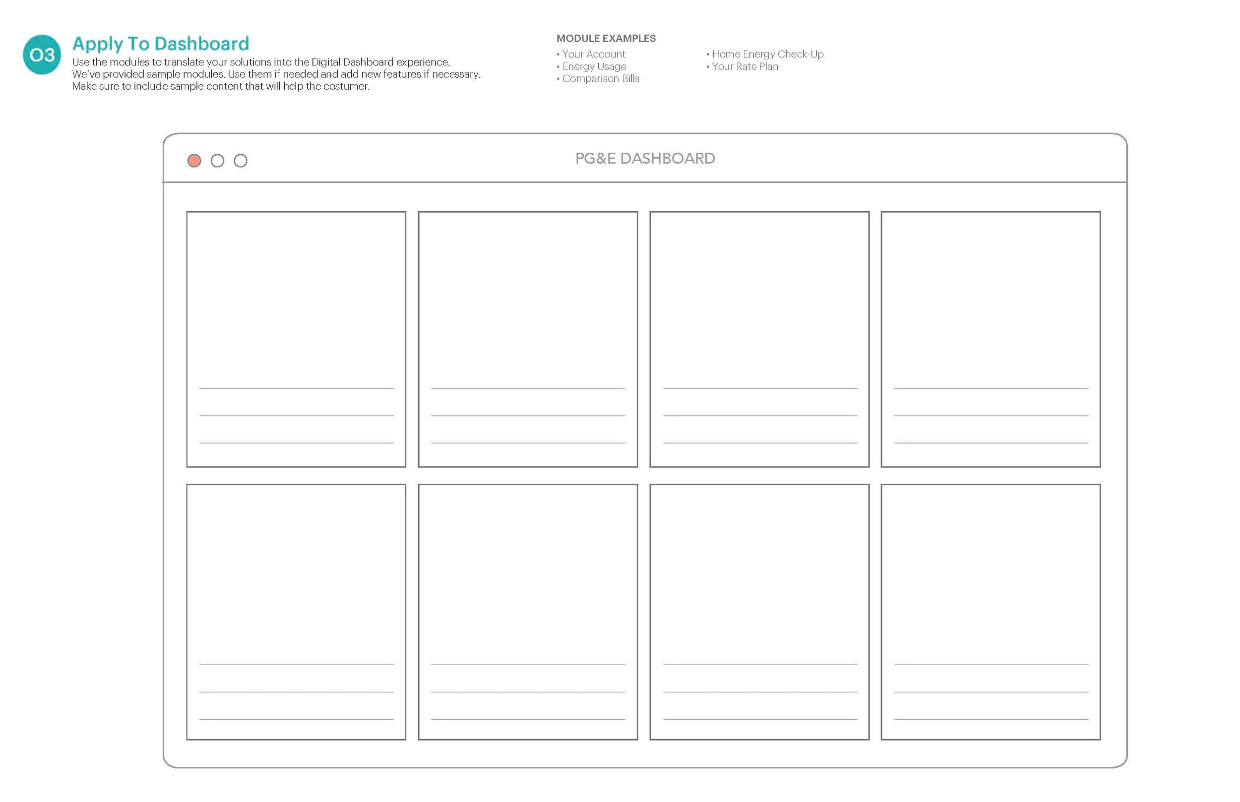
Utility dASHBOARd design [Process]
PG&E sought to provide tools that empower their customers to manage their utility needs via their online dashboard. The ask was to redesign key elements of the existing residential, solar, and business online dashboard to guide users to self-service tools and reduce the number of consumer center calls.
Timeline
1 Week: Immersion
2 Weeks: Hypothesis
5 Weeks: Design Sprints
2 Weeks: Prototype & Test
2 Weeks: Refine & Deliver
TeamDesign Director
UX Designer
UX Designer IIData Designer
Program Manager
Role: UX Designer IILead research planning, conduction, and synthesis.
Facilitated and moderate groups during workshops
Lead the restructure of the dashboard
Lead the creation of all sketches, wireframes, mocks, and prototypes.
Created delivery assets including annotated documentation, dashboard diagrams, redlines and style sheets.
IMMERSION
We conducted 10 in—person interviews with stakeholders from all involved business groups and customer care centers. Through these, we inquired about their respective customer dashboard experience to gather feedback and learn about their vision for the future. We also learned about how their consumer base used the dashboard and improvement opportunities.
In parallel, we collected and analyzed web behavior & click-through data, as well as call center data to discover user intent and commonly used tools. e took these learnings and reimagined the dashboard to create an action based structure to help customers self-diagnose and identify solutions to common customer service issues.
Create frictionless interactionsEnable easy-to-use interactions for customers to manage their life with PG&E by consolidating information and streamlining tasks.
“Business customers have various accounts. How they can pay them all at once?”
Be contextually awareAllow the customer to rely on PG&E to support them as their energy needs start, change, and evolve. The experience should be able to anticipate changes to prevent customer inquiries.
“During peak move seasons, we should be bubbling relevant services such as start of service, school address validation, etc.”
Inform customers for the future Show a customer their usage and rate information in an actionable manner that empowers them to better plan their consumption and track spending patterns.
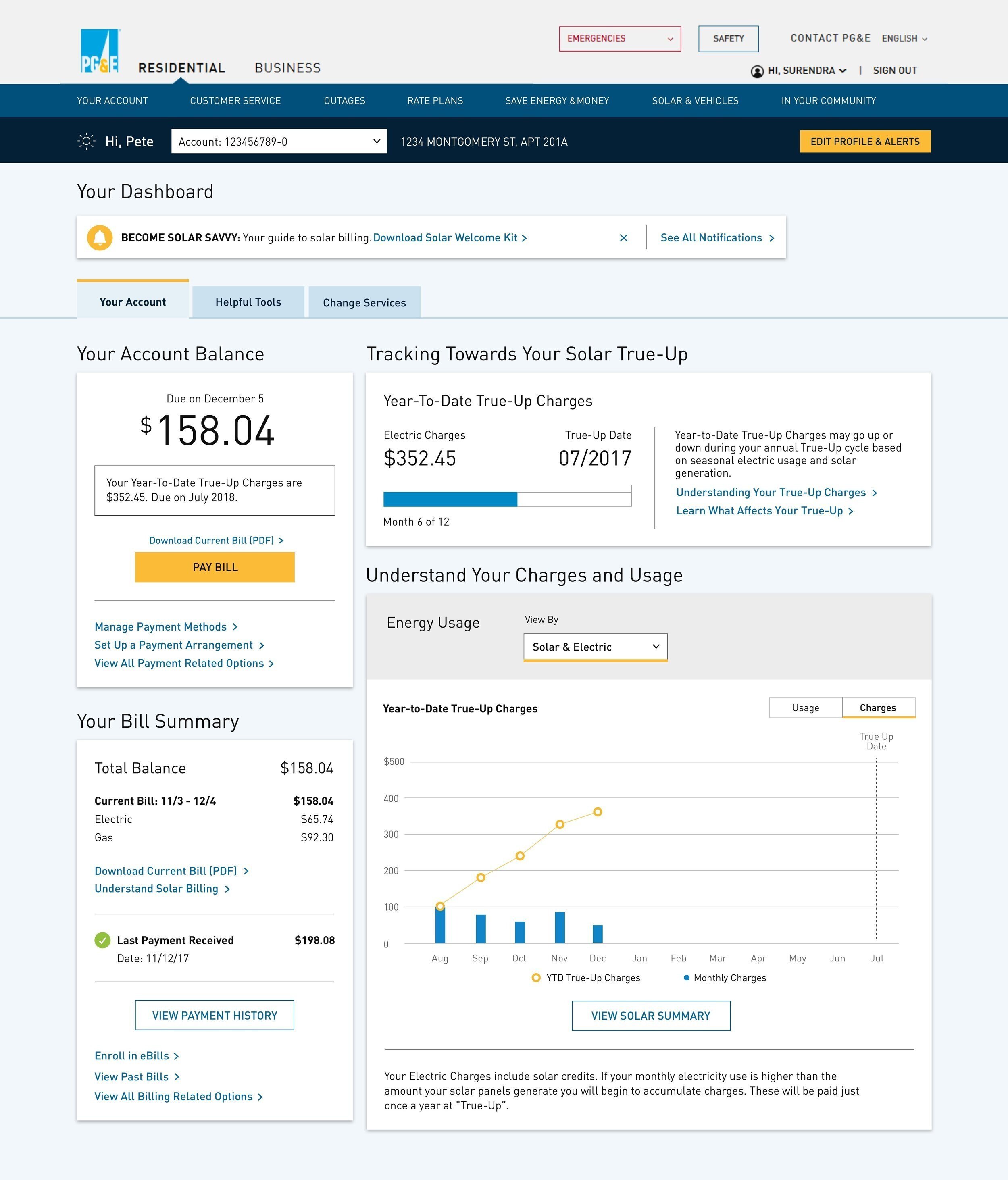
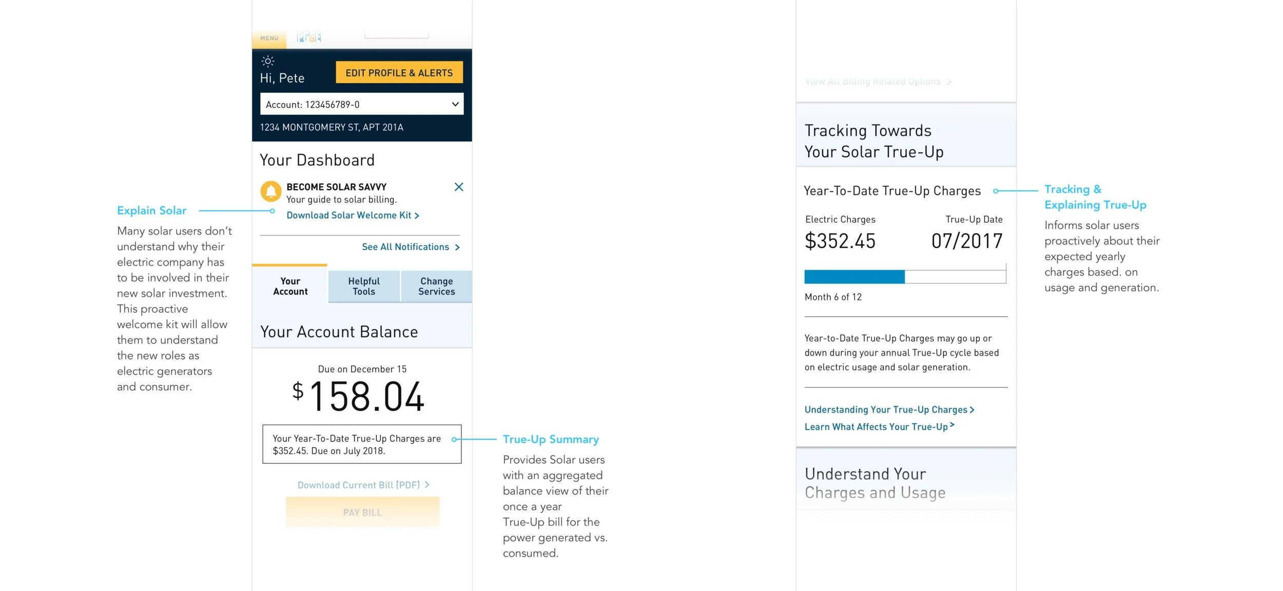
“For all our Solar customers, we want to emphasize the balance (True-up) in all of our interactions. What it is, when it’s coming, and how much it will cost.”
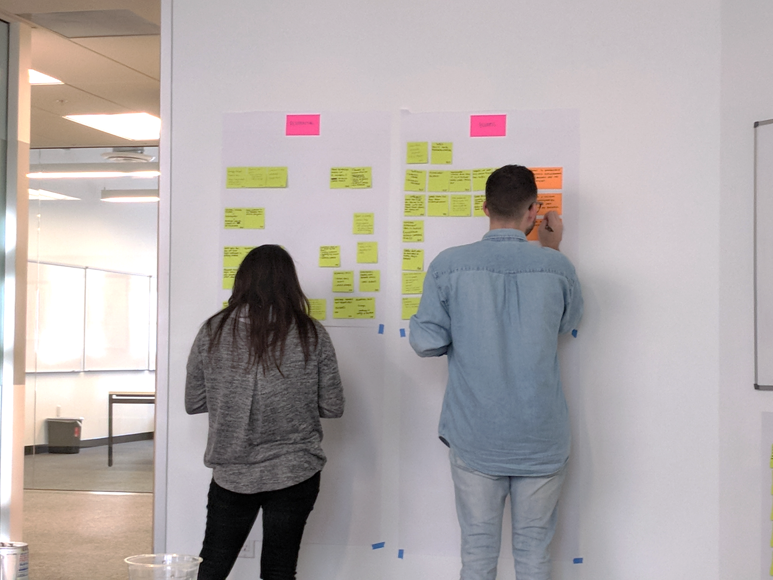
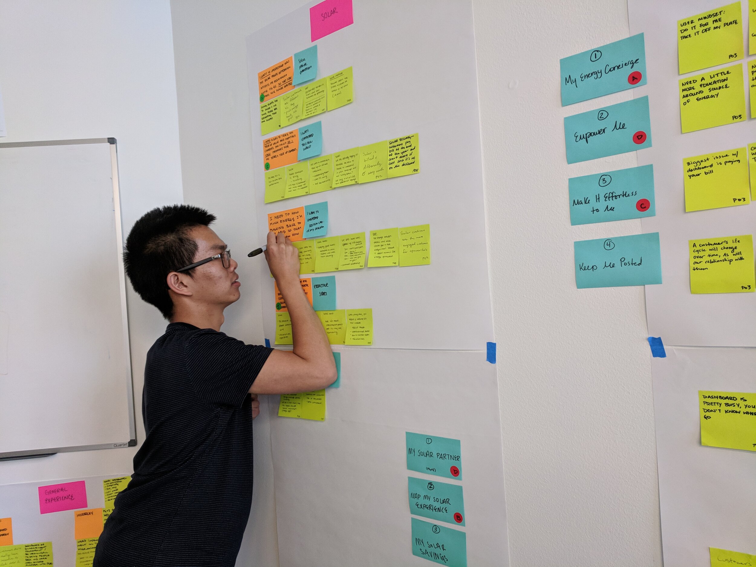
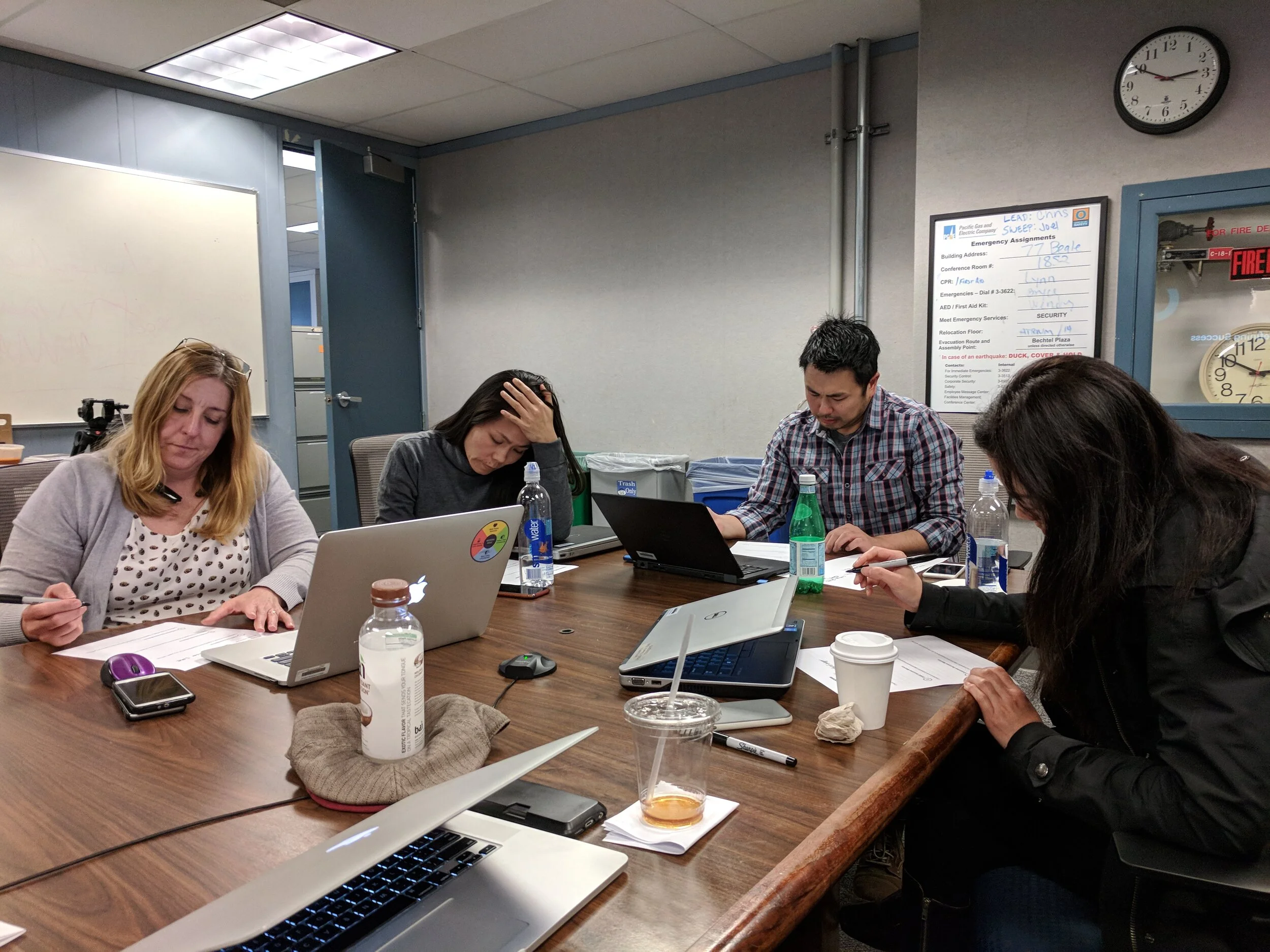
WORKSHOPS
We hosted a series of 3 design workshops, one for each business, to tackle the most pressing user scenarios generating call volume. For these, I generated artifacts and design exercises to help us understand processes and tease out what information was most valuable to the users.
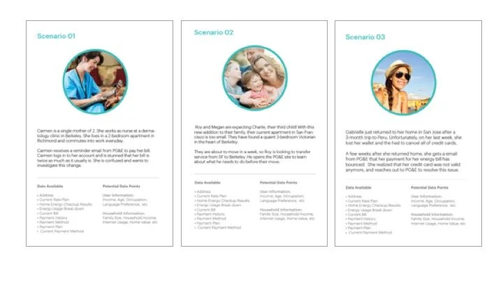
Scenario Cards & ExercisesTo build a connection to our target users, I developed Scenario cards for all 3 user types to share with the larger team in our workshops. These allowed us to communicate user context, their needs, and explain the most common user goal per business group
We ran co-creation exercises where the team had to prioritize and arrange functionality based on the user scenarios of each service dashboard.
RESTRUCTURING THE DASHBOARD
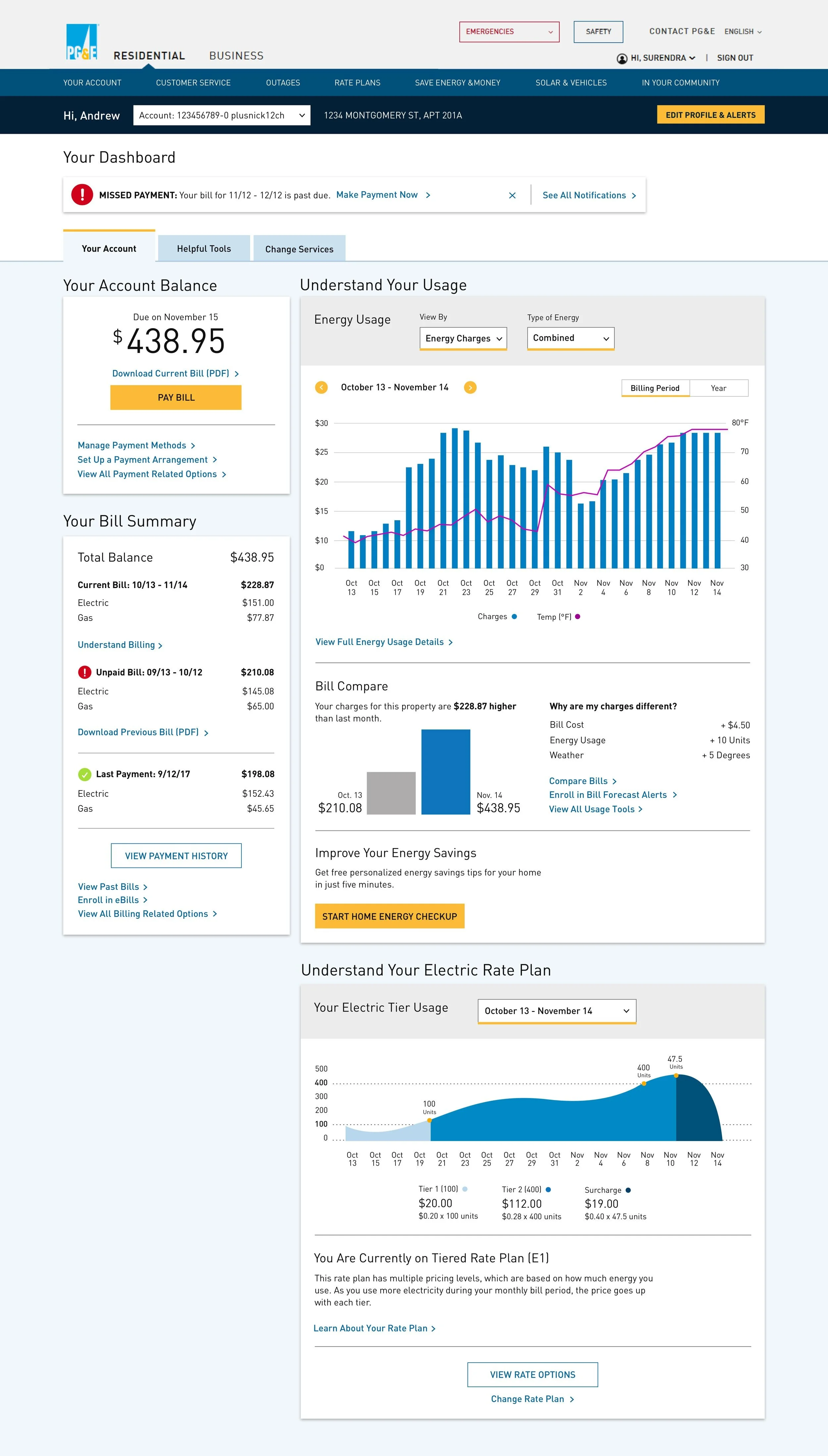
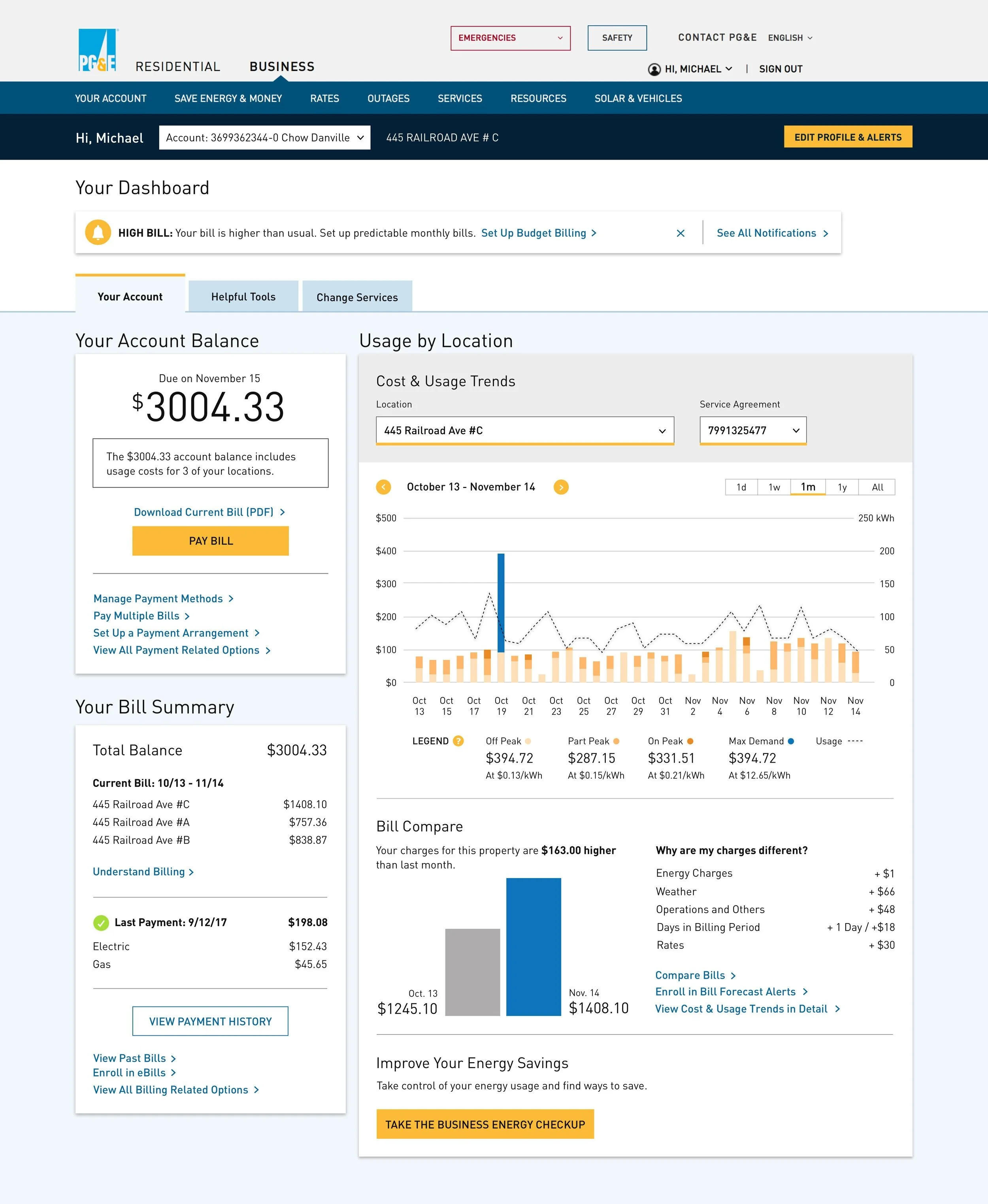
We reorganized the hierarchy of the dashboard into a three tab system that clearly delineates sections and aligns to the user’s primary actions.
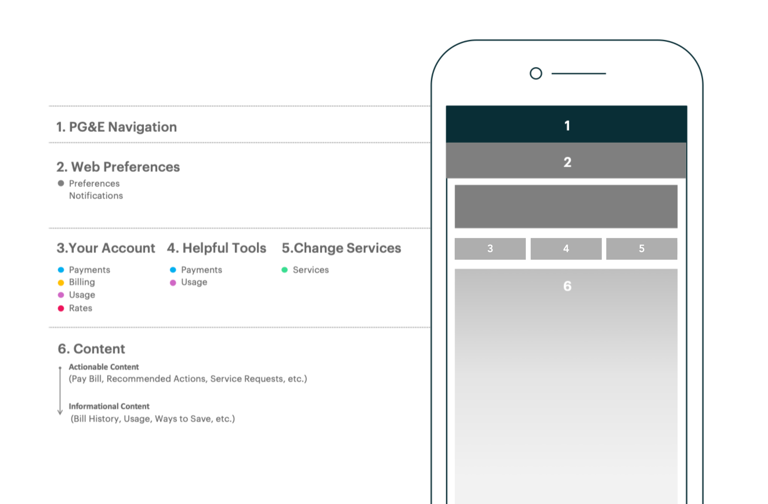
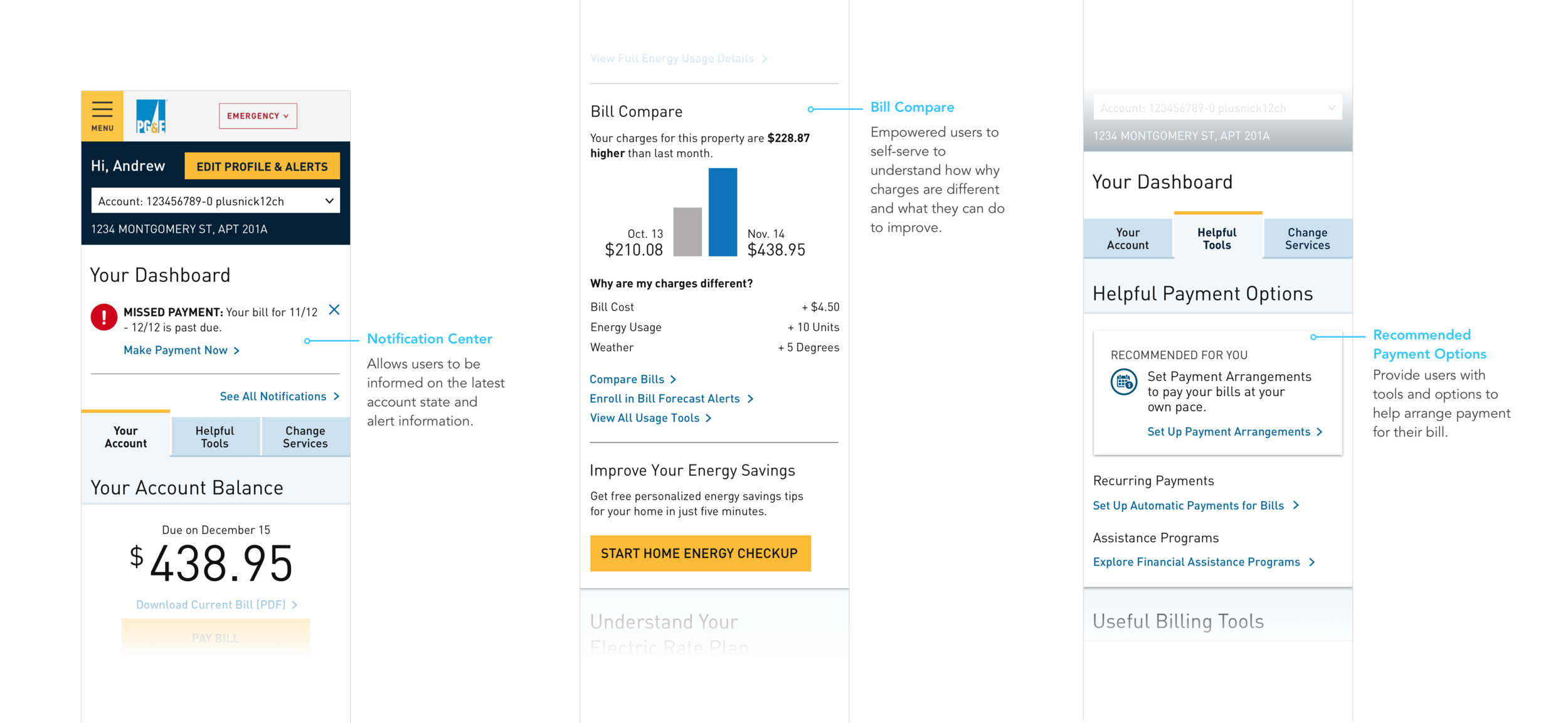
2. Web Preferences: Managing PG&E accountWe prioritized an Account Bar under the main navigation to give users access to account selection and preferences. We also added a Notification area that provides relevant notification, actionable recommendations, and alerts.
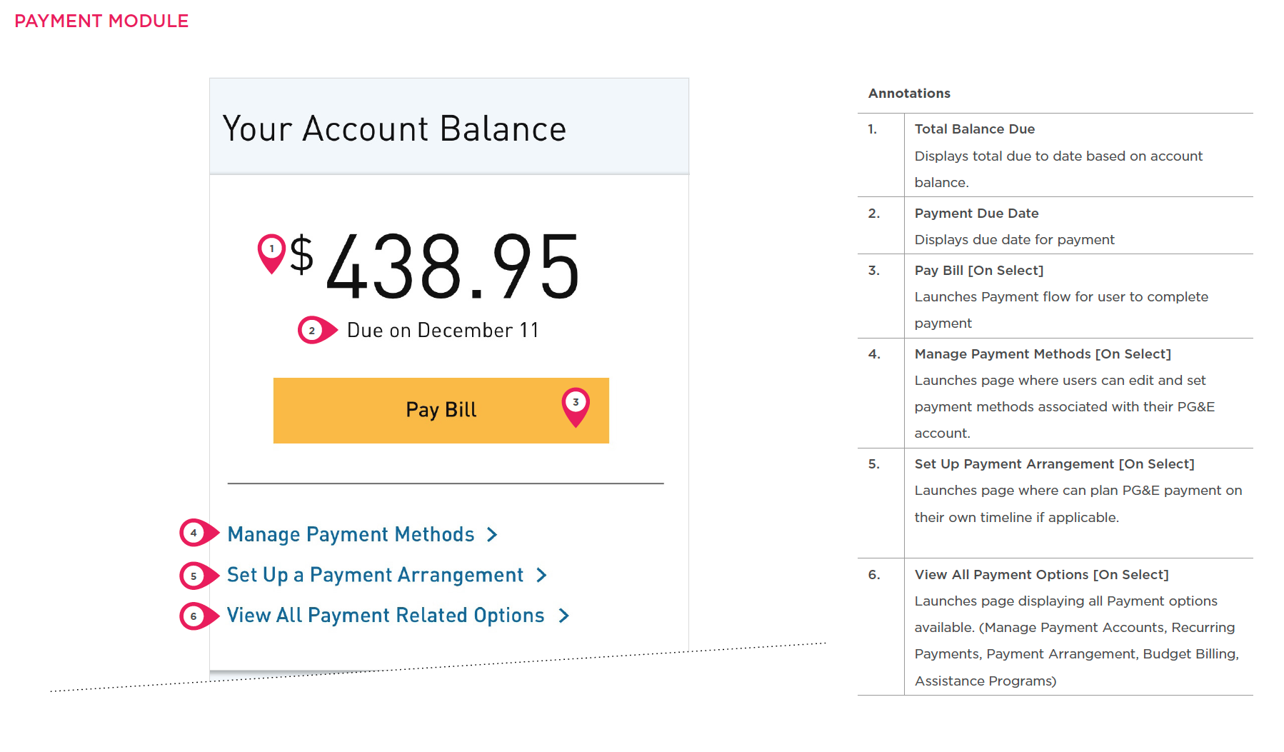
3. Your Bill: Understand & pay bill23.73% of users call to get quick access to their balance, payments, and billing. We unified balance, payment, usage, rates, and billing to give the user a holistic picture of their bill.
4. Helpful Tools: Payment planning, financial help, and best practicesThe overall design approach leaned on a scalable and touch-first oriented evolution of the existing DLS emphasizing aspiration and emotional expression, while maintaining systematic rigor and the authoritarian and angular aesthetic from the brand.
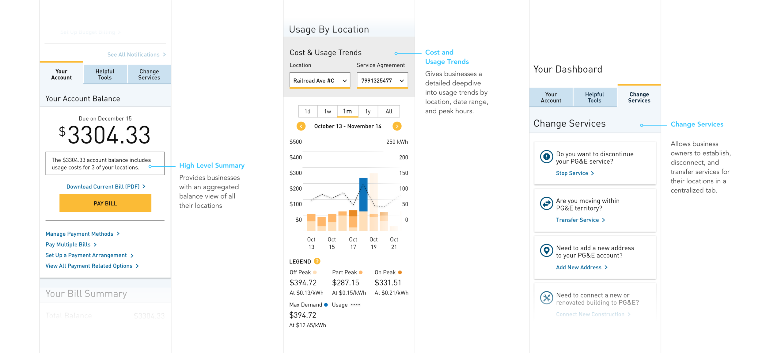
5. Change Service: All Service Requests29.96% of calls relate to start/stop/transfer service and service request. However, one 1.34% of web click data was collected for these actions. We populated a single tab to house this functionality for a user to quickly find and request services.
CONCEPT & ITERATION
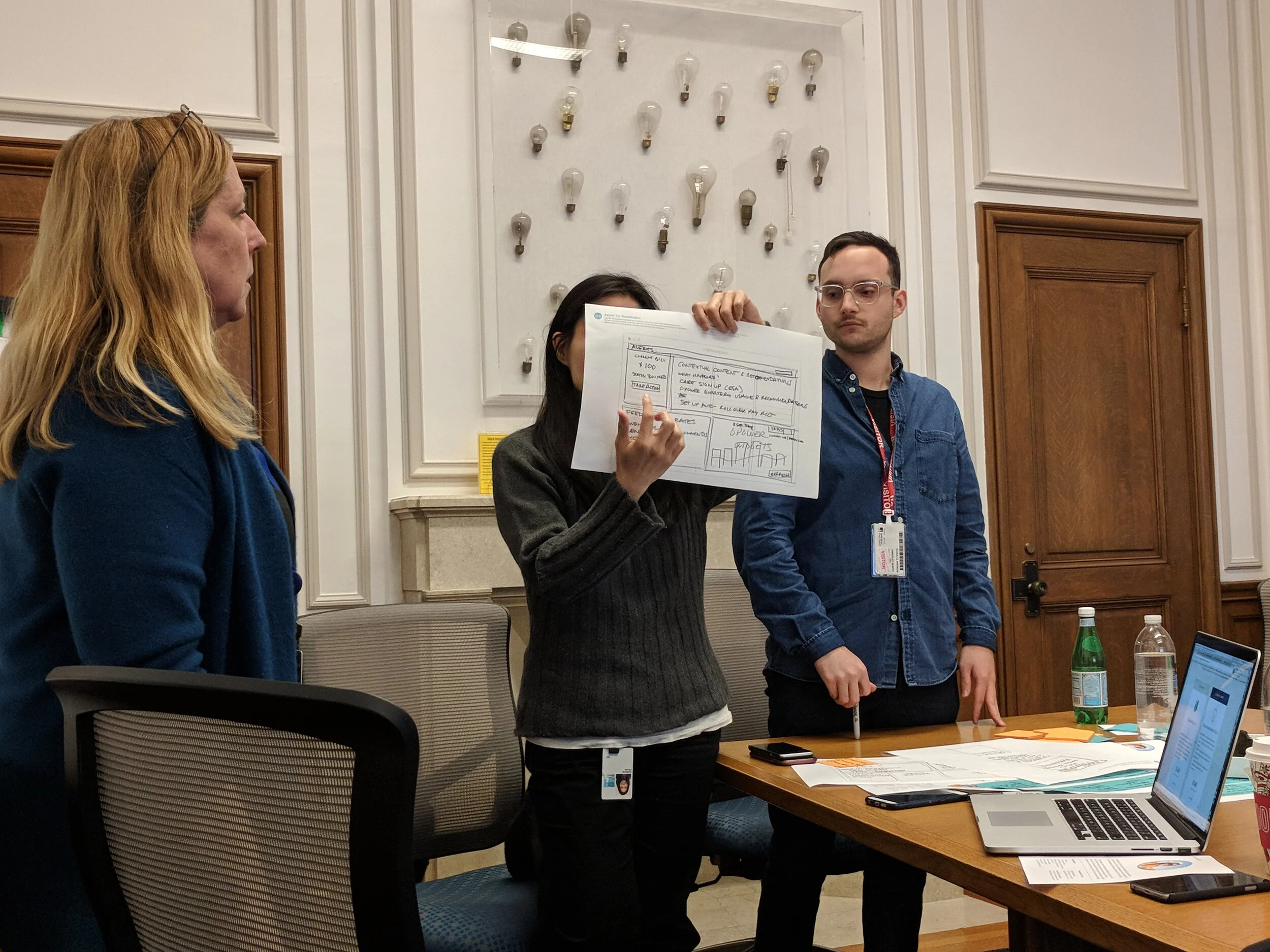
Once the structure was aligned on, we moved to quick sketches & wireframes. This allowed us to gain insight from the client as early as possible by surfacing any usability concerns to be solved before moving into higher fidelity.
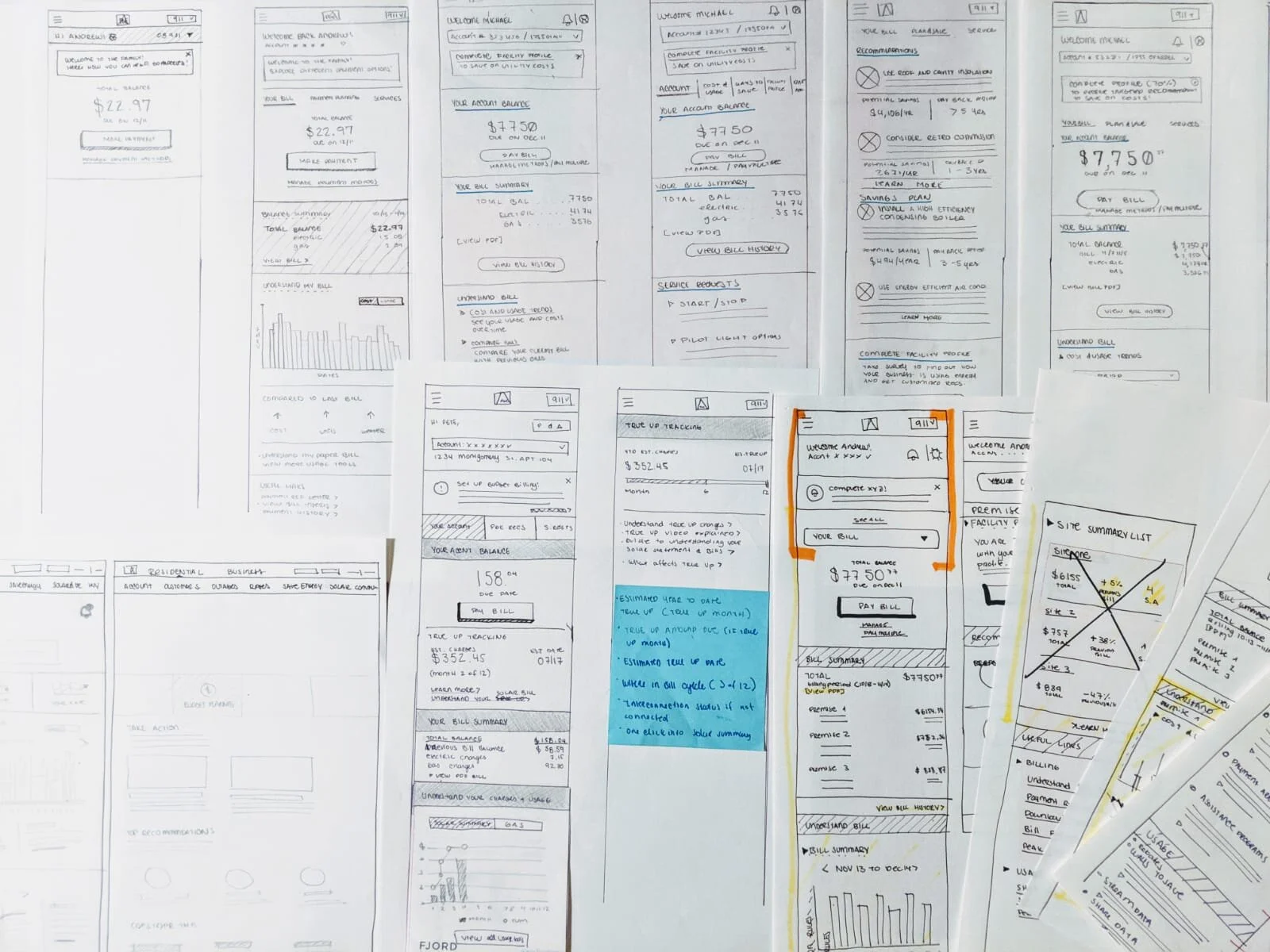
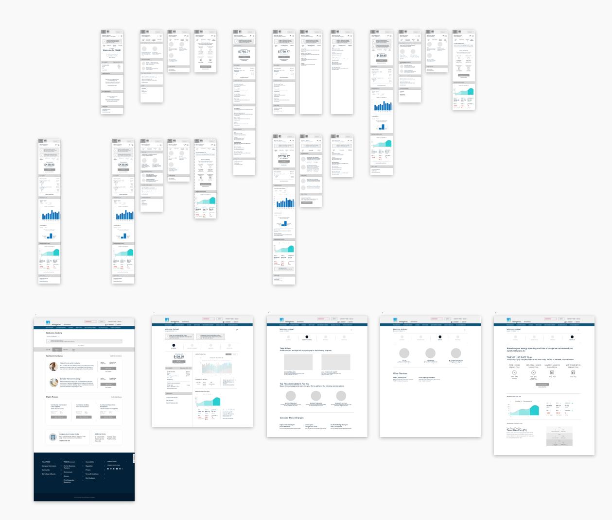
PROTOTYPE & TEST
Once the mocks were finalized, I generated Invision prototypes for all 3 dashboards. These were tested by a 3rd party agency in 3 locations. This allowed us to confirm some of our hypothesis and gather feedback on elements that needed to be improved. Below is some of the feedback we received.
Users responded well to the new tab approach. They mentioned it was easy to find features that could help them accomplish the task at hand.
Most of the users were confused by the graphs. It took them a bit to understand and digest the information.
Some of the graphs were missing scales and labels. We updated them with our recommendation however the graphs are pulled from a third party tool that partners with PG&E.
Users were uneasy about the scrolling on mobile to get back to the tabs.
REFINE & DELIVER
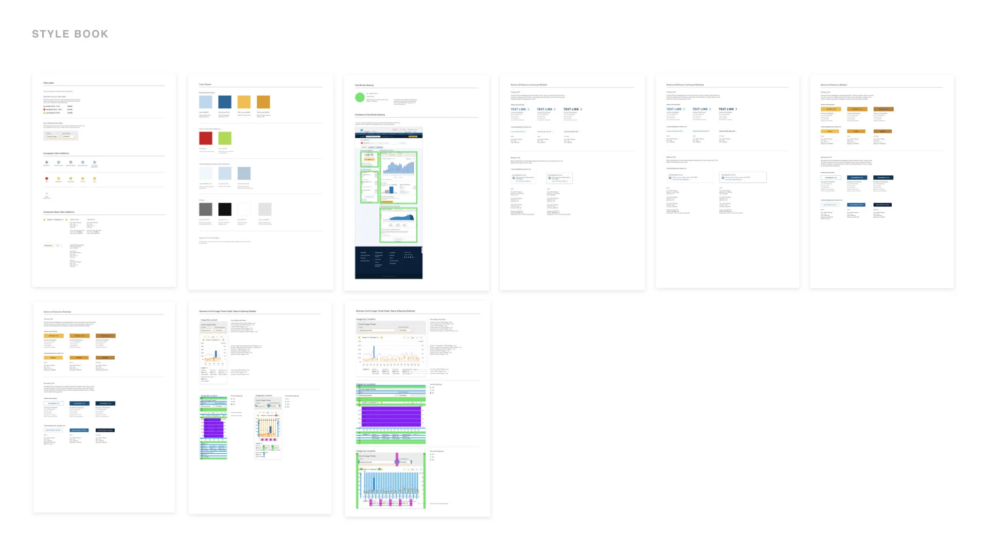
We refined the comps and prototypes, given the testing results and client recommendations, and delivered a set of high fidelity mocks, annotated documentation, dashboard diagrams, redlines, and a style sheet tracking the visual component updates.
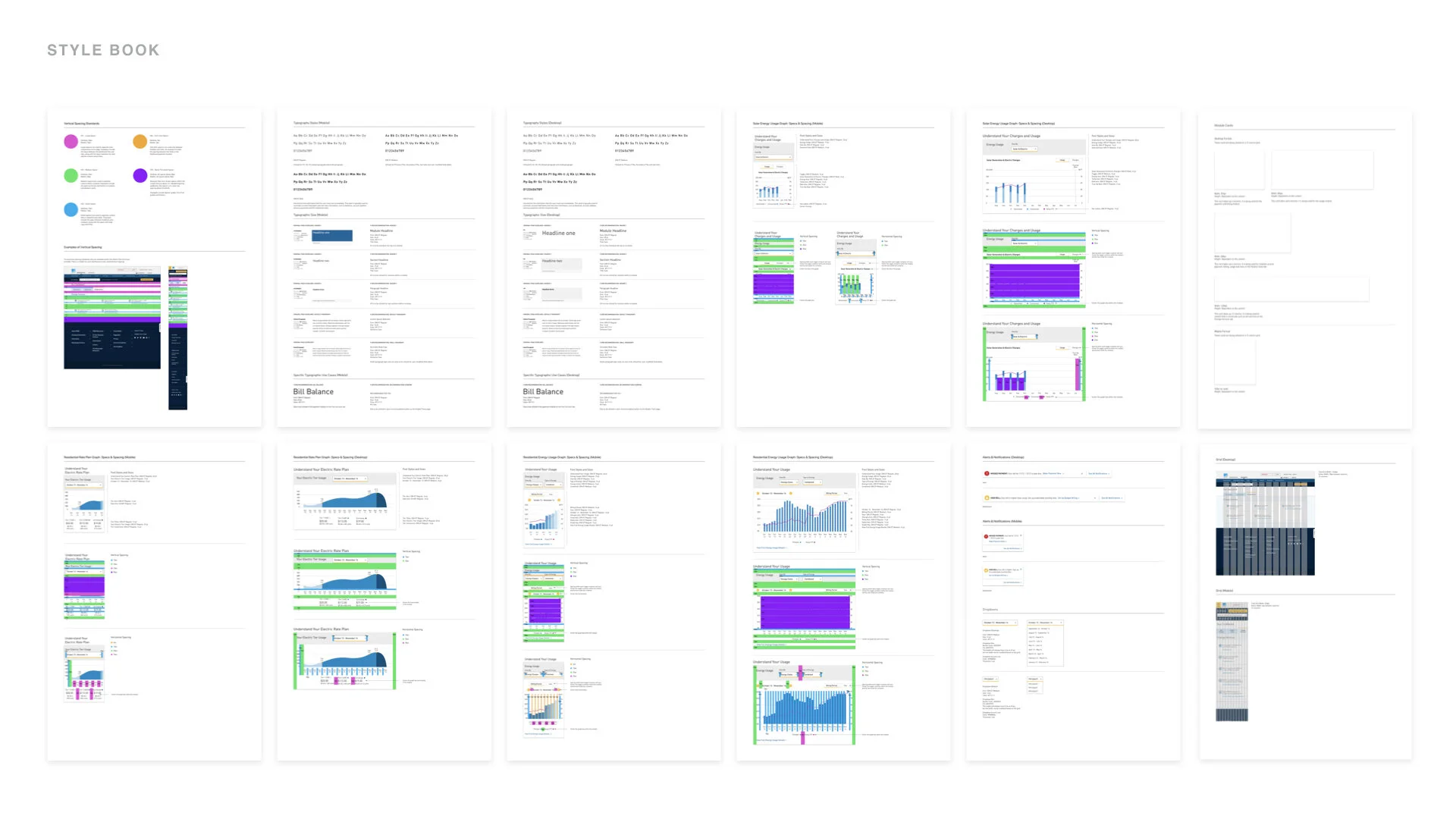

ConstraintsWe were instructed to use the current features and visual components of the dashboard. This gave us little chance to influence the functionality and the visual design of the redesign.
All graph tools are provided by a third party vendor. We edited the graphs and delivered a recommended state based on stakeholder and user feedback. However, these tools’ final functionality is dependent on that of its available API.
We evolved the current DLS to better suit the needs of the user. The proposed DLS is detailed in the style sheet that was delivered.
THE NEW DASHBOARD EXPERIENCE
Below are the highlights for the most common use cases per user.
RESIDENTIAL DASHBOARDS
BUSINESS DASHBOARDS
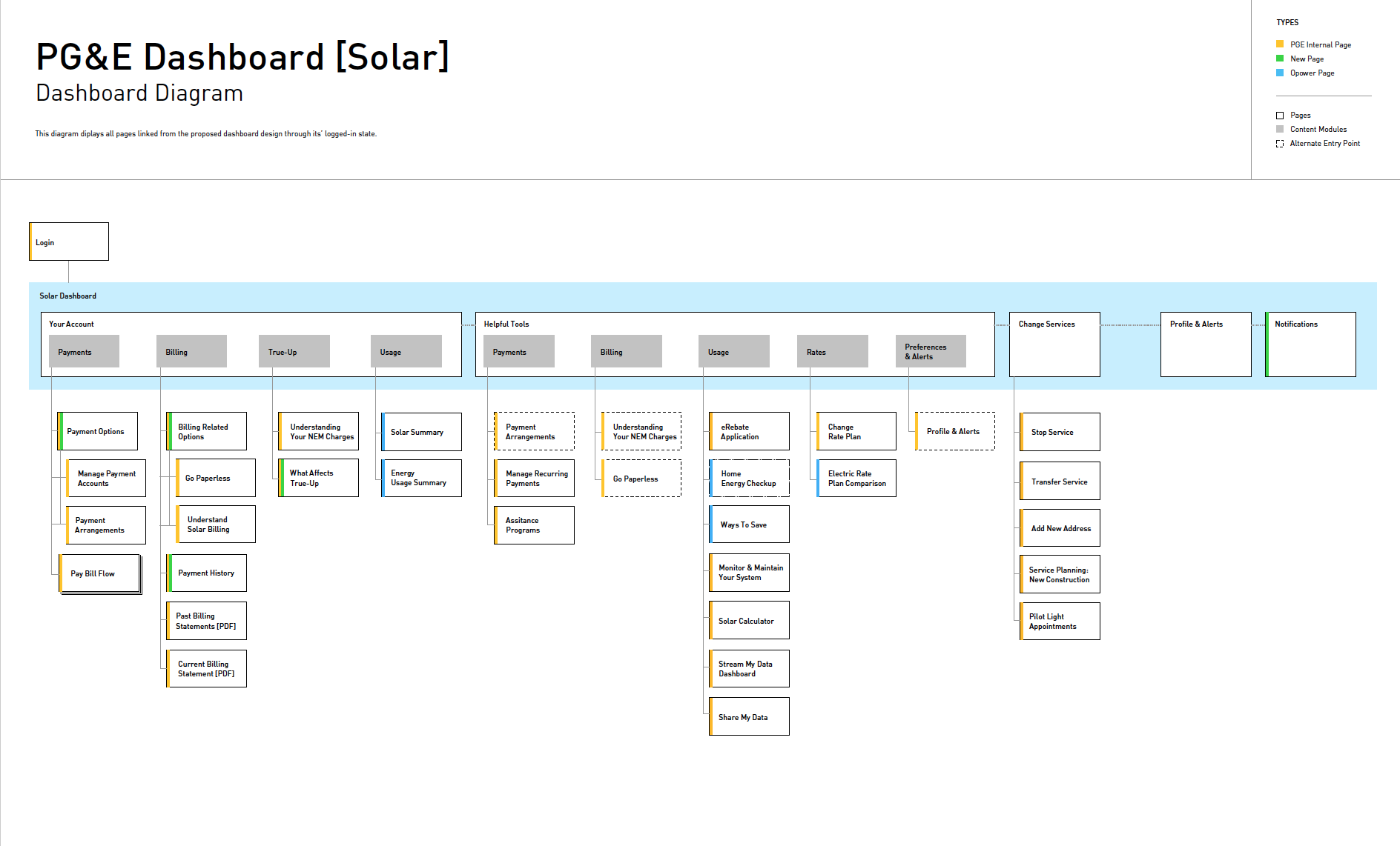
SOLAR DASHBOARDS